Case Study · Health · Clinical Trials
Designing the at-home clinical trial for 50,000+ participants.
At the Scripps Research Digital Trials Center, I helped take four health research platforms — All of Us, DETECT, PROGRESS, and PowerMom — from prototype to participant. The work spanned NIH partnerships, wearable integrations, and the early UX of biometric AI.
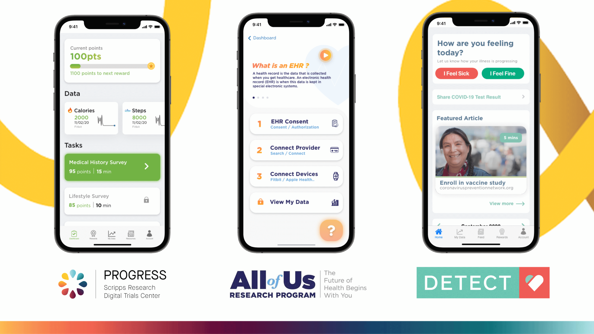
A note on confidentiality: the work below has been generalized to respect the IRB and participant-data agreements that govern these studies. Specific metrics and screens shown publicly here have been cleared.
Context
The Scripps Research DTC builds the digital infrastructure for clinical studies that don't require a clinic. Participants enroll from a phone, consent in-app, connect a wearable, and contribute years of biometric and survey data. The catch: the bar for trust, accessibility, and consent is the highest of any consumer product I've worked on, and the platform serves cohorts that range from teenagers to participants in their 80s.
Across two years I shipped on four platforms in parallel. Two stories matter most.
Story 1 — Closing the qualitative-data gap on All of Us
The problem
Scripps had abundant quantitative data — adherence, completion, drop-off — but almost no qualitative signal. Participants who wanted to give feedback had to call, email, or use live chat. The friction filtered out everything except the strongest opinions, leaving the team blind to the subtler reasons participants disengaged.
The call
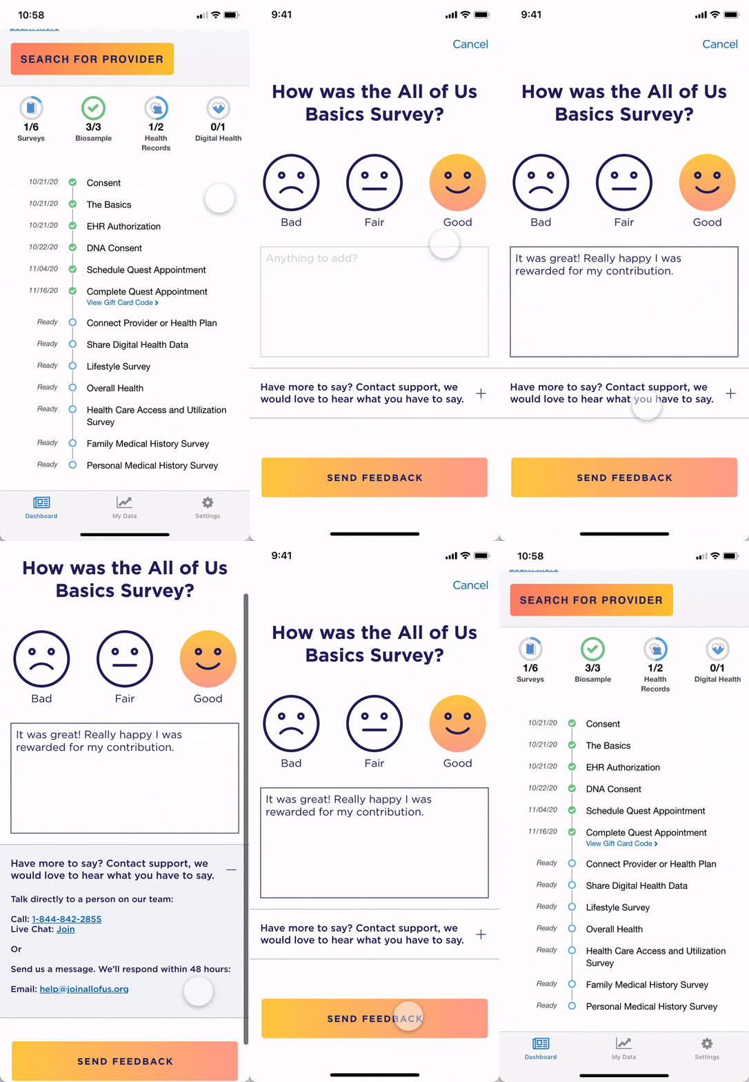
A traditional NPS-style survey would have backfired in a clinical context — too clinical-feeling, too detached from the moments that actually shape how a participant feels about a study. I argued for an in-context, low-friction feedback affordance reachable from any screen, with one-tap emoji input and an optional comment. The bar was: fast enough that no one regrets opening it.
What shipped
An emoji-led feedback mechanism with optional free text and a discrete "needs follow-up" escalation path. The team could finally see why participants disengaged on specific tasks, not just that they did.
Impact
For the first time the team could segment qualitative feedback by app surface. [PLACEHOLDER — e.g. "Drove a XX% increase in qualitative submissions in the first 60 days, surfacing three previously-invisible drop-off causes that informed the next quarter's roadmap."] The data also became leverage in stakeholder conversations — qualitative quotes carry weight quantitative dashboards can't.
Story 2 — Designing UX for an AI-driven biometric signal on DETECT
The problem
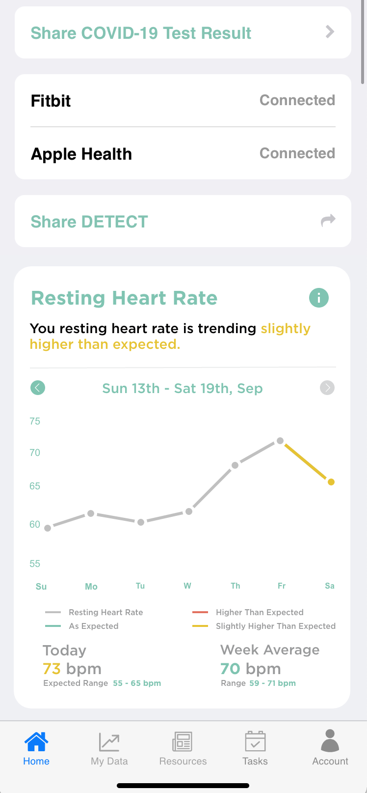
DETECT uses wearable resting heart-rate data to flag the early onset of viral illness, including COVID. The DETECT AI team built the model. My job was to figure out how to surface its output to a participant in a way that informed without alarming.
An AI-generated trend on a participant's resting heart rate is, technically, a probabilistic signal. Show it as a graph and people read certainty. Show it as an alert and people panic. Show it as nothing and the work has no value to the user.
The call
I designed a visualization that tells the participant what the graph means before showing the graph — the headline does the interpretive work, the chart is supporting evidence. Color carries the directionality (rising / steady / falling) without medicalizing it. The component intentionally avoids language like "elevated risk" — that judgment belongs to a clinician, not a chart.
Impact
In a usability study against three competing home-screen modules, this visualization came out as the most-likely-to-recommend among test participants. [PLACEHOLDER — add the numeric result if available, e.g. "preferred by XX% of testers; +XX-pt margin over the next-best concept."]
Other shipped work at Scripps
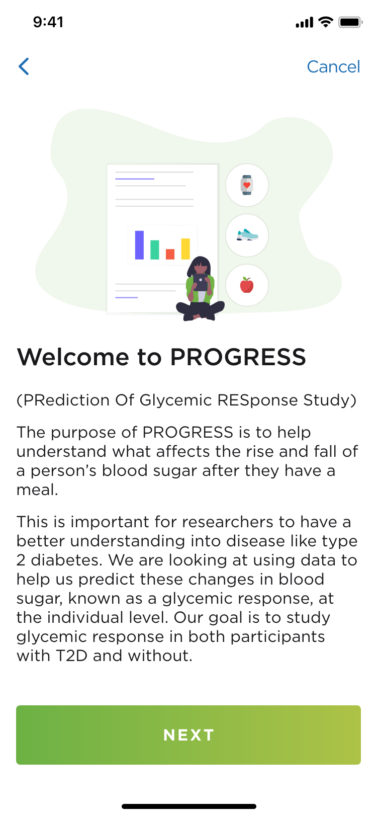
PROGRESS — Lead designer on the metabolic-health study. Built the brand system, design tokens, and a novel data visualization tying glucose readings to logged food intake, intended as a "delight loop" to keep participants engaged across the 10-day protocol.
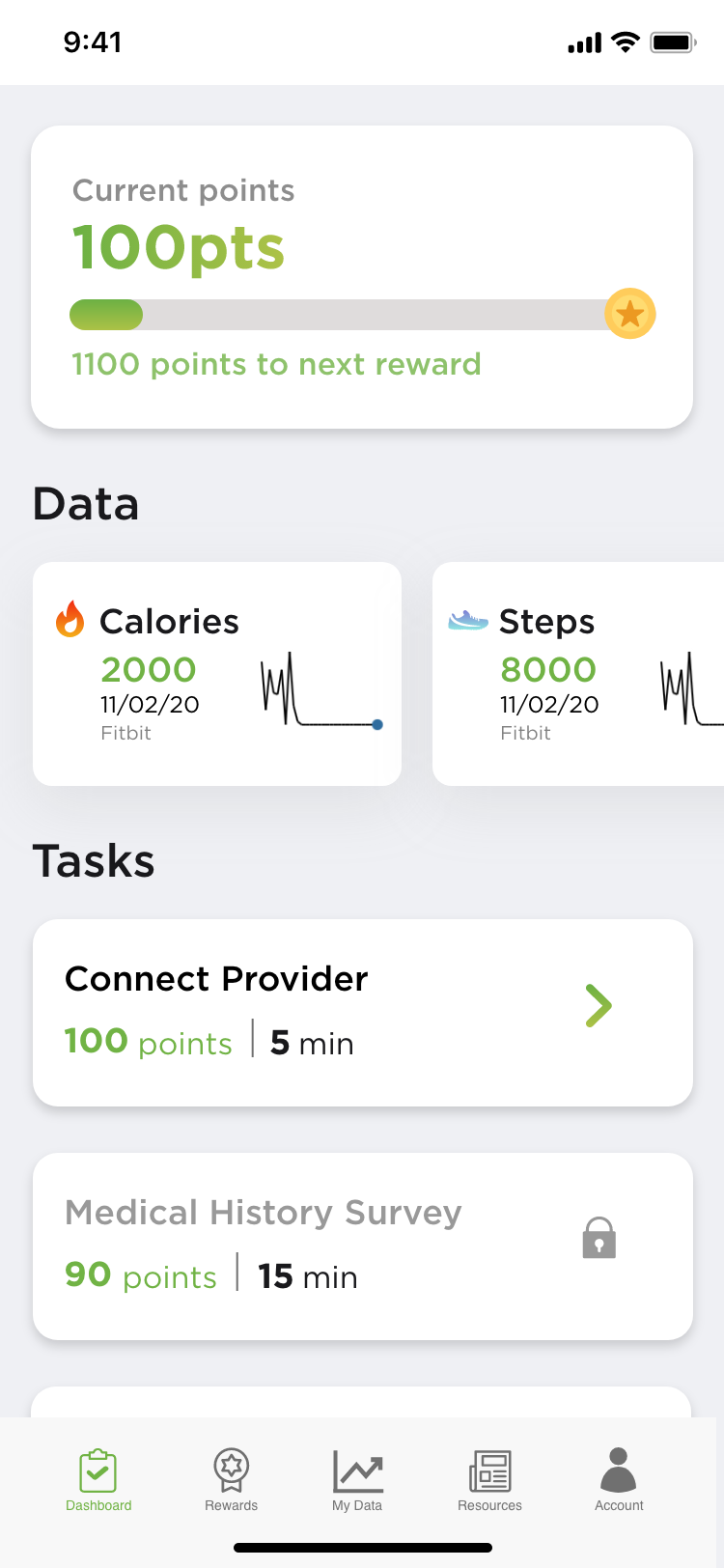
PowerMom — Lead designer on a maternal-health study aimed at reducing perinatal disparities. Built the brand, design system, and end-to-end participant journey map across enrollment, device pairing, and weekly check-ins.


Reflection
Two things have stayed with me since Scripps. First, designing in regulated health contexts taught me to treat uncertainty as a first-class element — every visualization, every prompt, every notification is an implicit claim about what we know. That muscle is the foundation of everything I do in AI design now.
Second, the highest-leverage move I made wasn't a flashy redesign — it was an emoji button. The lesson: in research-grade products, simple feedback rails outperform clever visualizations because they compound across years of study data.