Earlier Work · Health · Research
Designing trust in continuous glucose monitoring.
As part of UCSD's Diabetes Design Initiative, I worked with research leads, developers, and designers to surface UX improvements for the Dexcom G6 sensor and companion app — focused on the moments where trust between a person and their wearable is most fragile.
Context
For people with diabetes, a continuous glucose monitor is the difference between guessing and knowing. But the trust required for someone to actually act on a wearable's reading — adjust insulin, eat, drive — is earned, not assumed. The Diabetes Design Initiative asked: where does that trust break, and what design can rebuild it?
What I worked on
I joined the project under Lars Mueller, head of the Diabetes Design Initiative, focused on the moments in the Dexcom experience where trust was most fragile: sensor warm-up, calibration mismatches, alerts that conflict with how a person feels. The work involved contextual research with users, synthesis with the broader DDI team, and design proposals that reframed how the app communicated uncertainty.
Auditing the existing information architecture
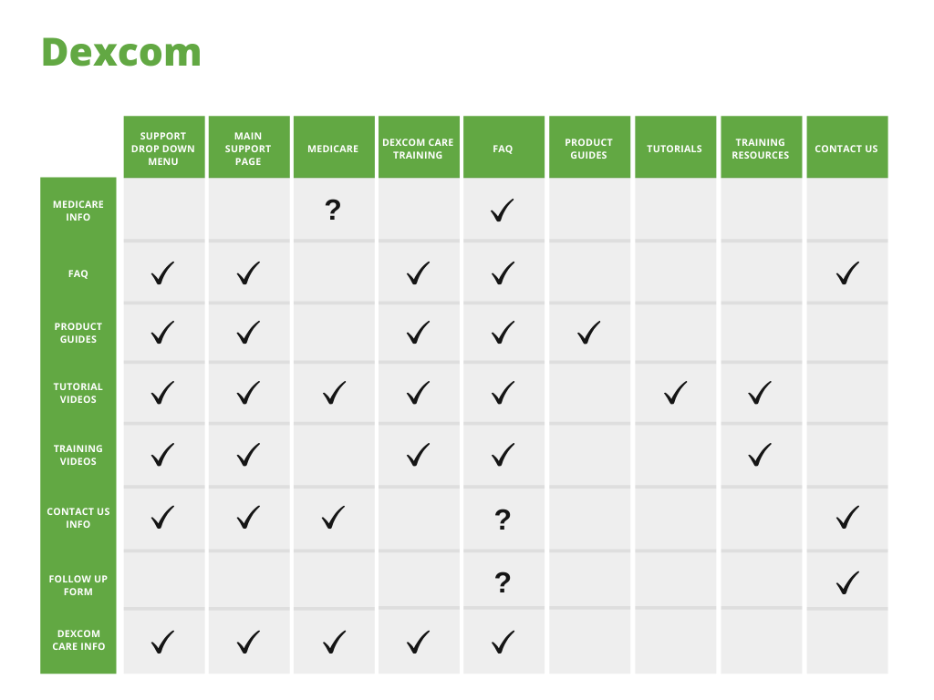
Online research showed users would rather call Dexcom or browse forums than navigate the site for answers — a signal that information architecture was actively pushing people away from self-service. My team and I conducted a full site audit and mapped the paths users took to reach the same content, and where content was missing entirely.
The DDI seven-week design sprint
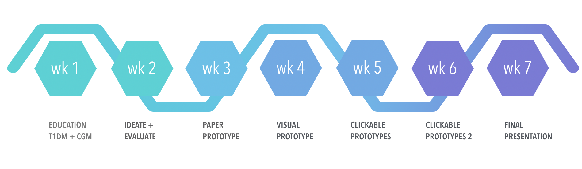
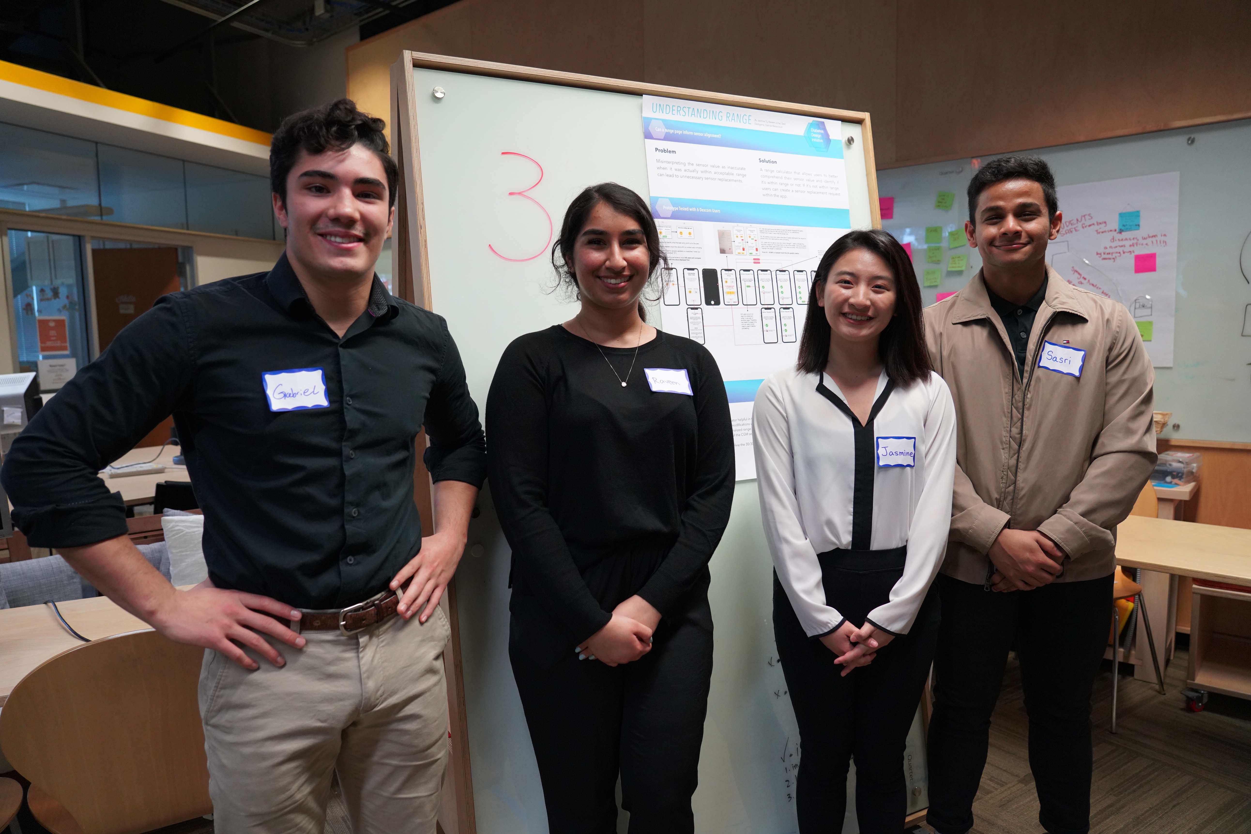
In Fall 2019, I helped form the Diabetes Design Initiative — a seven-week program structured as weekly design sprints. Each week we interviewed users, prototyped, tested with diabetes patients and industry professionals, and iterated. The final deliverable was a hi-fi prototype built in HTML, CSS, and JavaScript.
Brand work: the DDI identity
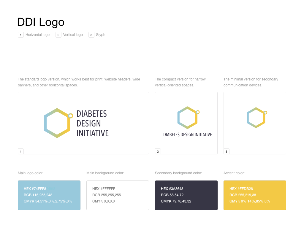
I designed the DDI logo and built the website in HTML, CSS, and JavaScript. The mark uses a hexagon (the structure of a glucose molecule) inside a closed loop (the synthetic-pancreas system), in blues (trust) and yellows (creativity) — the two pillars DDI was founded on.
This was where I first encountered the design problem I now spend most of my time on: how do you design an interface that knows things imperfectly, in a context where being wrong has real consequences? The vocabulary I built here — confidence, calibration, graceful degradation — became the spine of how I think about AI-driven health tools today.
Reflection
I list this project not because the deliverables themselves were career-defining, but because the framing was. Dexcom is the project that turned me from a designer interested in health into a designer who understood that health interfaces are uncertainty interfaces. Every shipped artifact since has carried that insight forward.