Earlier Work · Accessibility · Mobile
An adaptive interface for connecting seniors and volunteers.
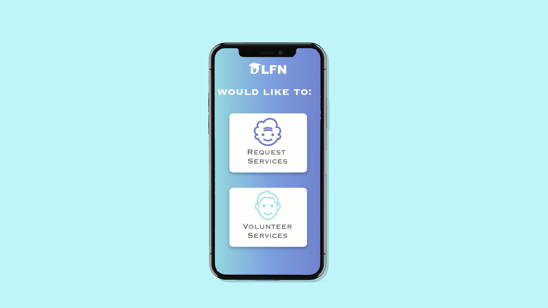
DLFN was a mobile app that paired isolated seniors with volunteers — designed with the dual constraint that the same interface had to feel intuitive to a 19-year-old volunteer and a 78-year-old first-time smartphone user.
Context
Loneliness in older adults has the same mortality risk as smoking 15 cigarettes a day. DLFN's hypothesis was that pairing seniors with neighborhood volunteers — for groceries, conversation, transport — could reduce that risk if (and only if) the app didn't itself become a barrier.
The hard call
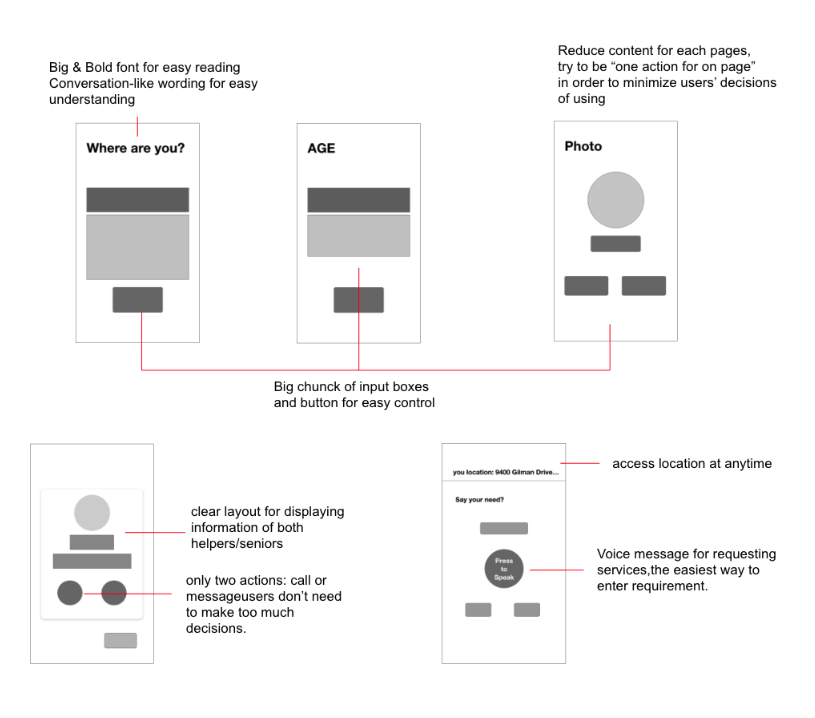
Two-sided apps usually solve their UX asymmetry by building two different interfaces. We didn't have that luxury — small team, small budget. So I designed an adaptive single interface that responded to the user's age cohort and accessibility preferences set during onboarding: larger touch targets, simplified hierarchy, optional voice input on the senior side; standard density and notification-driven flows on the volunteer side.
Personas and storyboarding
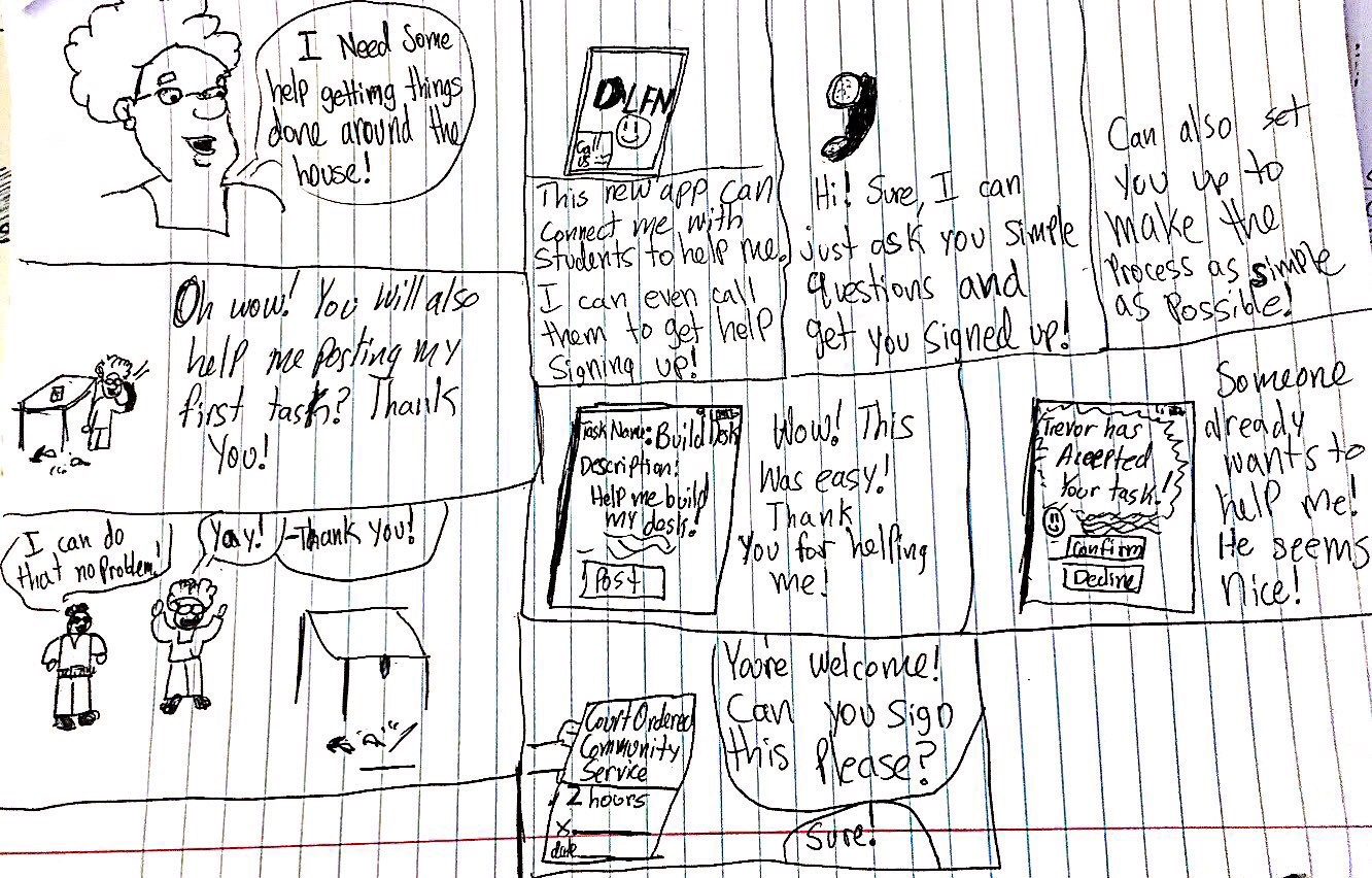
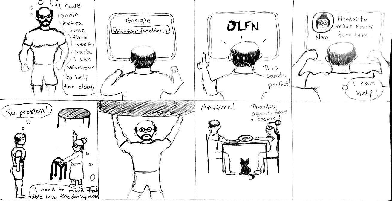
We built two personas — one for the senior side, one for the volunteer side — and storyboarded the two distinct first-time-use experiences. For seniors, we designed a phone-call onboarding flow inspired by accessibility programs that exist today.


Competitive analysis & flows
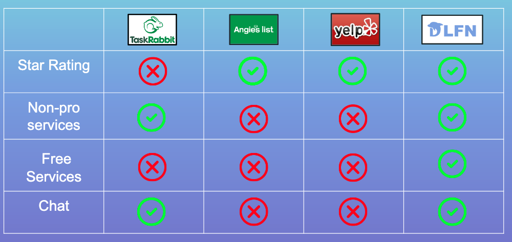
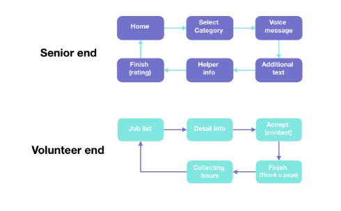
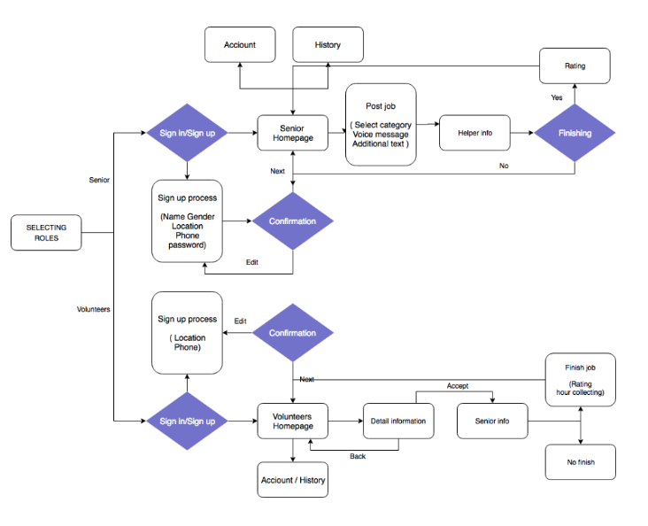
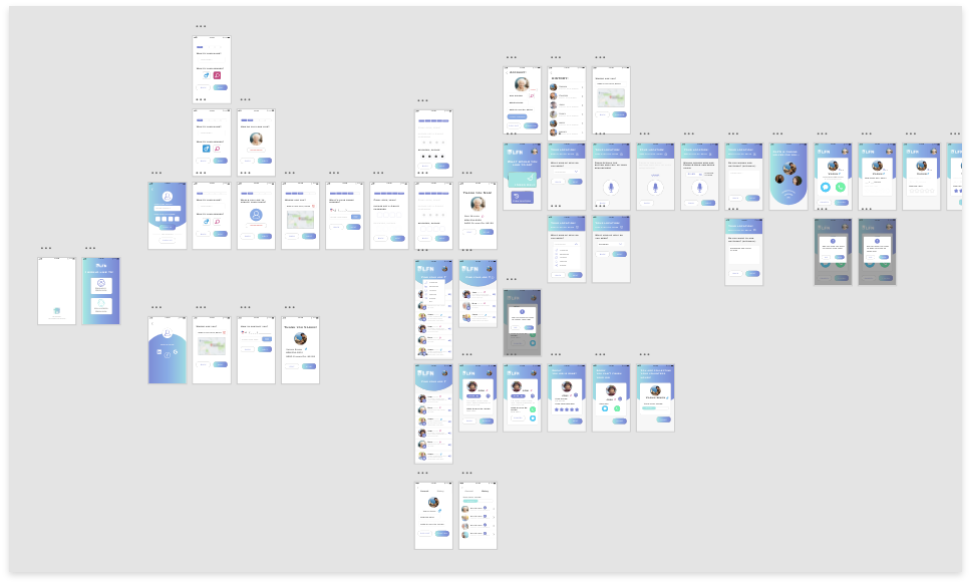
We benchmarked DLFN against existing services and mapped both high-level and detailed user flows for each persona.
Lo-fi to hi-fi with accessibility as the constraint
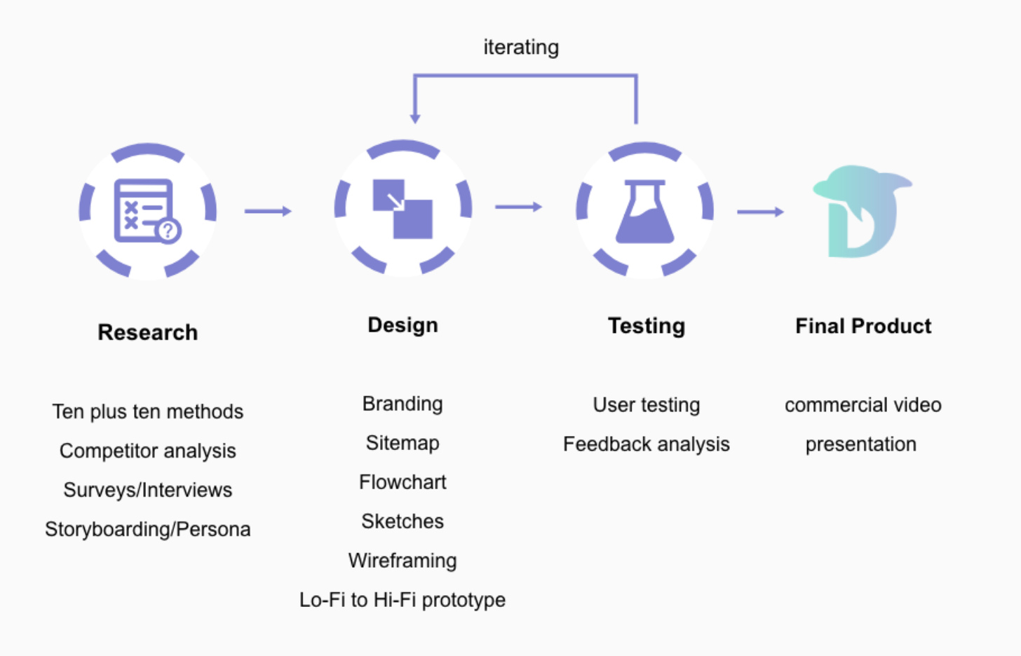
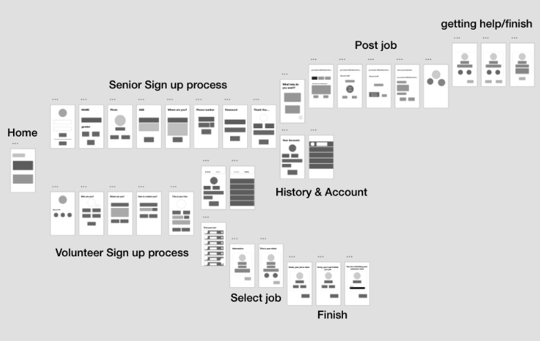
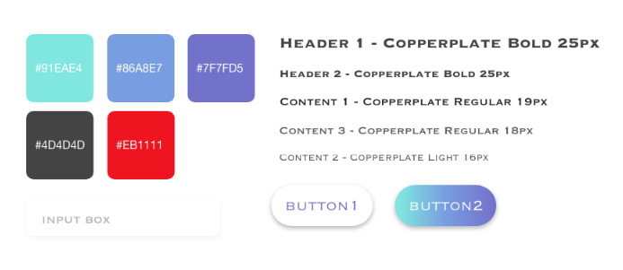
We started with skeleton screens in Adobe XD, then applied accessibility-first decisions — larger font sizes, reduced recall, alternative input methods. The mini design system locked in colors, fonts, and button styles before we moved to hi-fi.
What I learned
Designing for accessibility as a constraint is different from designing accessibility as an afterthought. When the older user is the primary persona, you stop adding accommodations and start choosing primitives that work for everyone. The lesson stuck — accessibility now informs my type scales, target sizes, and motion defaults across every project.